CSS Essentials
Image Properties
| Preserve aspect ratio | Fill the container | |
|---|---|---|
object-fit: fill(default) == background-size: cover | ❌ (stretch) | ✅ |
object-fit: cover != background-size: cover | ✅ | ✅ (cropped) |
object-fit: contain == background-size: contain | ✅ | ❌ (empty space) |
Selector
Pseudo-class: Define a special state of an element
article p:nth-child(2): Select every<p>that is the 2nd child of its parent.article p:nth-of-type(2): Select every<p>that is the 2nd<p>of its parent.button:active: Select the button when it is clicked.
Pseudo-element:: Style specified parts of an element
p::before { content: '', color:... }
Reference selector
a[href *= ".com"]: Select những href containing ".com".#sentence > p: Cácpở tập hợp con nhỏ hơn 1 bậc so với id "sentence"..sentence + p: MỘTpduy nhất liền sau kết thúc của class "sentence"..sentence ~ p: TẤT CẢ cácpliền sau kết thúc của class "sentence"
inherit vs initial vs unset
inherit: kế thừa thuộc tính của các phần tử cha gần nó nhất.initial: sử dụng style mặc định của trình duyệt.unset:parentHasStyle ? inherit : initial
Layout modes
Flow (Default), Positioned (e.g. position: absolute), Flex, Grid, Table, Multi-column, Float
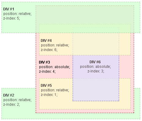
z-index
Only works in positioned elements, Flexbox, Grid, and Multi-column elements.
Note that the default z-index is auto which means a child element having z-index larger than 0 can mess up the stacking order of its parent with other siblings. To ensure the stacking order, set z-index of the parents to numbers rather than auto.
- Root
- DIV #1
- DIV #2
- DIV #3
- DIV #4
- DIV #5
- DIV #6
Flexbox
Aligning Flex Items along the Main/ Cross Axis
Main Axis
justify-content and auto margins
Cross Axis
align-items: Align flex items along the cross axis.align-self: Overridealign-itemsof the flex container.align-content: Control how rows are positioned in multi-row flex and grid containers
flex property details
flex-grow- MAX: Chỉ định tỷ lệ kích thước to nhất mà phần tử nên có so với các phần tử còn lại.0(Default): Kích thước của các phần tử sẽ khớp với nội dung bên trong → có thể ko lắp đầy hếtParent.>= 1: Ví dụ có 2 phần tử: Child1:grow: 1, Child2:grow: 3→ Cả 2 sẽ lấp đầyParentnhưng Child2 sẽ chiếm nhiều hơn gấp 3 lần.
flex-shrink- MIN: Kích thước nhỏ nhất mà phần tử nên có. Giá trị càng lớn thì phần tử càng nhỏ.1(Default): Take up the same amount of space at all times.0: Bất chấp giữ nguyên kích thước, dẫu có phá vỡ layout.
flex-basis- IDEAL: Kích thước lý tưởng của phần tử.
Priority:flex-basis(limted bymax-width&min-width) >width>content. Vì vậy chỉ nên setflex-basischo flex item thay vì setwidthcho nó.auto(Default): Dc tính toán theo nội dung và các phần tử khác.1000px: Trình duyệt sẽ hiểu là "Hãy cố gắng dành ra1000pxcho phần tử này". Cái này còn phụ thuộc vào nội dung của những phần tử khác - Nếu nội dung mấy phần tử khác mà to quá thì cũng chịu.
Width: min-content vs max-content vs fit-content
.box {
  width: fit-content;
  /* ... is the same as ... */
  width: auto;
  min-width: min-content;
  max-width: max-content;
}

clientWidth, offsetWidth, scrollWidth

clientWidth,clientHeight: The visual portion of the box content, not including borders or scroll bars , but includes padding . Can not be calculated directly from CSS, depends on the system's scroll bar size.offsetWidth,offsetHeight: The size of the visual box incuding all borders. Can be calculated by adding width/height and paddings and borders, if the element hasdisplay: block.scrollWidth,scrollHeight: The size of all of the box's content, including the parts that are currently hidden outside the scrolling area. Can not be calculated directly from CSS, depends on the content.scrollbarWidth=offsetWidth - clientWidth - getComputedStyle().borderLeftWidth - getComputedStyle().borderRightWidth
Display
inline(<span>) vsinline-block(button, select, input):- Same: Size depends on content, can be aligned with
vertical-align. - Difference:
inlineignoreswidth&height, acceptsmargin&paddingbut only horizontally. Vertical space it takes up depends online-height.
- Same: Size depends on content, can be aligned with
block(div, h3, p): Take up as much horizontal space as they can.flex,grid,none
Position
absolute: The element is removed from the flow of the page and positioned at a specified position relative to its closest positioned (elements which have apositionvalue which is notstatic) ancestor if any, or otherwise relative to the initial containing block. These elements do not affect the position of other elements.fixed: The element is removed from the flow of the page and positioned at a specified position relative to the viewport and doesn't move when scrolled.sticky: Sticky positioning is a hybrid ofrelativeandfixedpositioning. The element is treated asrelativepositioned until it crosses a specified threshold, at which point it is treated asfixed-positioned.relative: Ở chỗ cũ nhưstatic, but now can be adjusted relative to itself, without changing layout (and thus leaving a gap for the element where it would have been) e.g. we can useleft/right/top/bottom/z-index.static
Without any z-index value, elements stack in the order that they appear in the DOM (the lowest one down at the same hierarchy level appears on top)
transform: translate(1px) vs left/right/top/bottom
transform: translate(1px): Move the element without affecting the position of other elements.left/right/top/bottom: Move the element and affect the position of other elements if:- The element is
relativepositioned (notabsoluteorfixedas these remove the element from the normal flow of the page). - Other elements are positioned based on the
relativeelement.
- The element is
Box model
box-sizing: content-box: Size =Content→Padding&Borderlàm width to hơn so với ý muốn.box-sizing: border-box: Size =Content+Padding+Border.
border vs outline
outline is not a part of the box model. It is drawn outside the element's border. It doesn't take up space, so the element's width and height are not affected. Use cases:
outline: noneto remove the focus ringOverflow detect:
main.css* {
outline: 1px solid #f00 !important;
}